AmesburyTruth Branding
AmesburyTruth had very basic branding guidelines (pretty much just logo and simple font specification), but as the company and marketing presence grew, they needed to create a consistent look and clearly communicate what they offer. We started by adding onto their branding guidelines, including a color palette, fonts, logo usage, and additional icons. This branding was applied to stationery as well as PowerPoint and newsletter templates.
BRANDING
ILLUSTRATION
COLORS
FONTS
ICONS
STATIONERY

AmesburyTruth Value Proposition
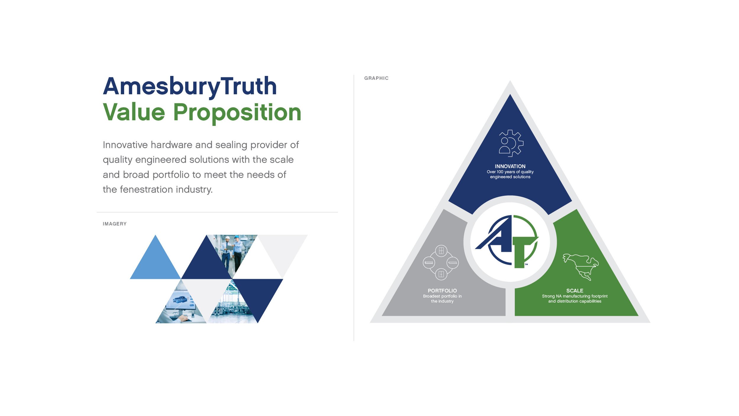
AmesburyTruth didn’t have a value proposition, so it was difficult to show customers and suppliers how they stood out in the crowded fenestration industry. We developed a graphic based on a triangle to communicate stability, and broke it into three basic sections: innovation, scale, and portfolio, each with an icon and talking point. The graphic, wording, and angular design elements were carried across print and social ads, in-building signage, and t-shirts.
BRANDING
ILLUSTRATION


